Brand Name: Tata Simply Better
Sector: Food & Beverages
Brand Reach: India
Services:
Packaging Design
Brand Storytelling
Another name for trust
The name Tata resonates with millions of Indians. As India’s largest and most diversified conglomerate, Tata stands tall as an emblem of trust and reliability. With a sprawling presence across diverse industries — from steel and automotive to consumer goods and hospitality, Tata Group has cemented its stature as one of the most regarded brands, globally.
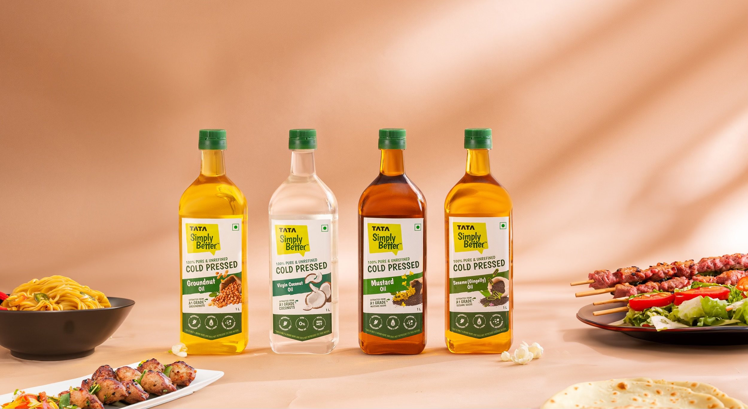
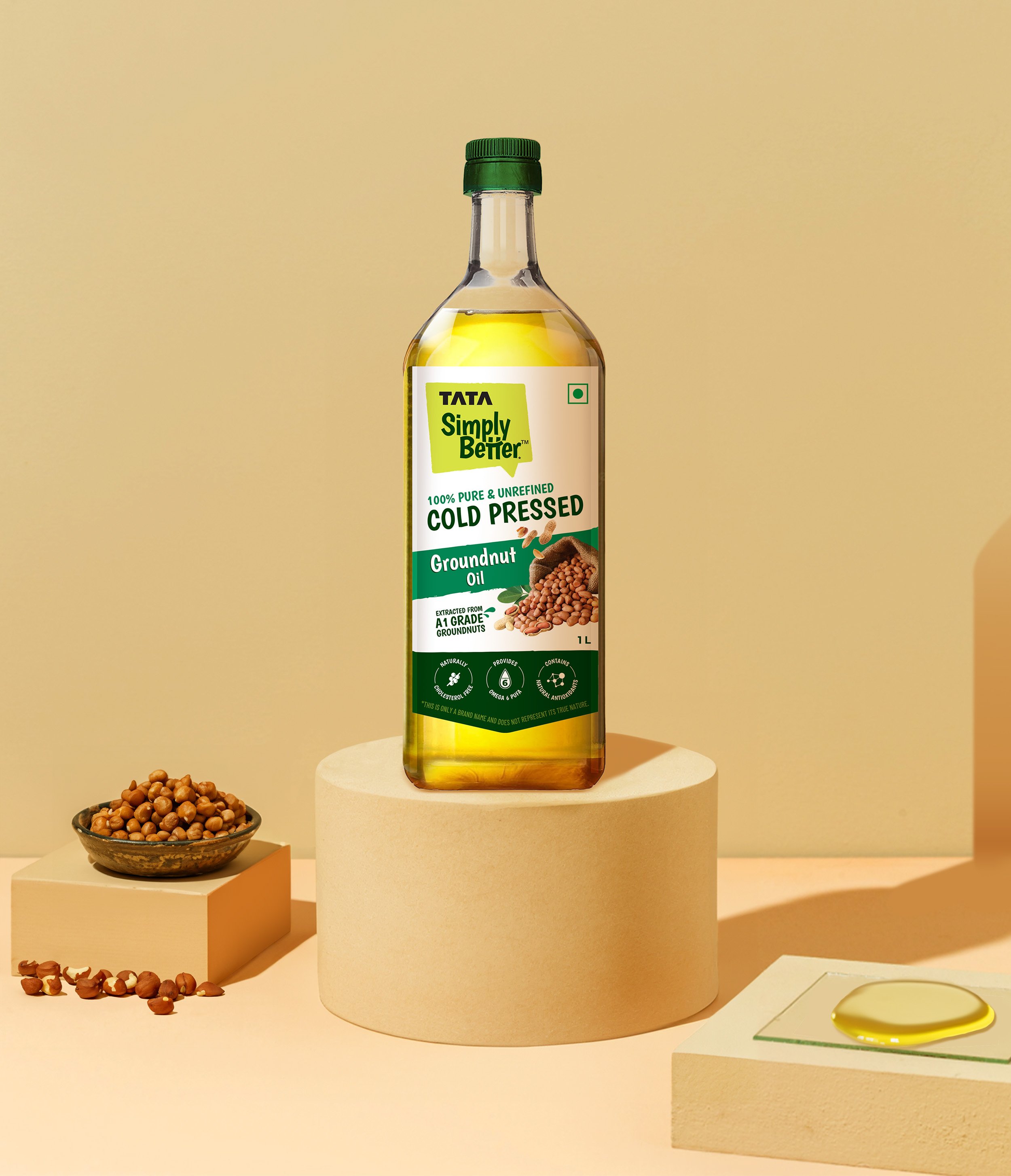
Tata Group’s invincible spirit is reflected in Tata Consumer Products Limited, the FMCG division that delights India with everyday essentials. Tata Simply Better is a young brand in the portfolio of TCPL. As the name implies, it strives to be “Simply Better,” with quality ingredients and superior taste. Tata Simply Better currently offers Cold Pressed Oils & mock meats. We partnered with the brand to create the packaging design system that expresses the brand’s commitment to purity and flavour.
Simply Better Packaging Design
The brand attributes like the logo and the brand fonts are stylised in informal style, lending to the aesthetics of the packaging where the typesetting too, is in a friendly theme. The absence of structured grid allows for playful treatment and optimised use of space on the label.
The claims on the packaging can’t explicitly promise ‘better than competition’, hence, the responsibility of communicating the promise was squarely on the design itself. So, we purposefully designed at each element of the packaging design — investing as much thought to the fonts and colours as we invested towards image photography and the choice of words. Packaging design, after all, is the sum total of all these elements.

The angled text elements mirror the angle of the Simply Better logo itself. We smartly used the call-out in the logo to point towards the 100% Pure and Unrefined Cold Pressed. While the variant name and the variant imagery are juxtaposed, the emphasis on the imagery makes the packaging stand out on the shelf. Moreover, treatment of imagery represents the lightness and purity of the products.

The subtle brush stroke elements across the packaging design underlines the brand’s personality — casual and conversational. The claims like ‘A1 Grade ingredients’ reflect the brand’s human approach, instead of vague claims about quality. After an insightful study of the market, deep green was assigned as the category colour for the entire range of Cold Pressed Oils. All variants own a family shade of green, coherent to the category colour.

The white background and the transparency of the bottles effortlessly cue the purity of the products. The curve at the bottom is a design decision, adding dynamism and visual interest. The thoughtful visual hierarchy dictates the viewer’s eye movement. And this packaging design, like every other we have crafted, is a beautiful symphony of various design elements.


When love is infused into the craft, it really shows. Our partnership with Tata Simply Better extends beyond, as we continue to work on future product lines.
Let’s build your brand!
SIMILAR CASE STUDIES

Rostaa
India & Middle East // Strategy, Logo & Packaging Design

Day Healthy
Packaged Food & Beverages // Brand Creation