Brand Name: Mahindra & Mahindra
Sector: Automobiles // Corporate
Brand Reach: India
Services:
Brand Visual Expression
Website UI Design Principles
Digital Design System
Great websites are experiences
They are simple and responsive, letting people engage with the content while communicating effectively.
We believe a good website doesn’t create an unnecessary barrier to user’s experience. We set out to refine the human interface for Mahindra & Mahindra group websites. Mahindra group has scores of websites that were in the past created by different companies, offering unique experiences. While these websites delivered well on function, they lacked coherence and design synchronicity.
Delivering coherence
We set out to create harmony for Mahindra group websites with a comprehensive user interface guidelines. These guidelines would bring order to the diverse Universe of Mahindra group. They would help standardise the navigation style, Mahindra logo placement across scores of website and the body layout of these websites.

We believe that fundamental design principles help create rich user experiences. When we look at the following images, the dot in the centre grabs attention. The same dot when placed off-centre gives an unsettling feeling, thus grabbing more attention.

If we create concentration of the dots at the centre, now they seem more important than the off-centred dot. A good user interface prioritises user’s time and presents content in ways that everyone can understand.

On the right image, even when we have more concentration of dots in the centre, the off-centred dots seem more important. It is because of proximity and closeness of the dots. User interface design is principles-led, that adapts to various contexts makes the experience pleasurable.
Based on these principles, we can see how the website of world’s largest search engine is created. It draws the attention to the centre of the page. Lesser important links come on the top of the page.
Understanding Eye Movement
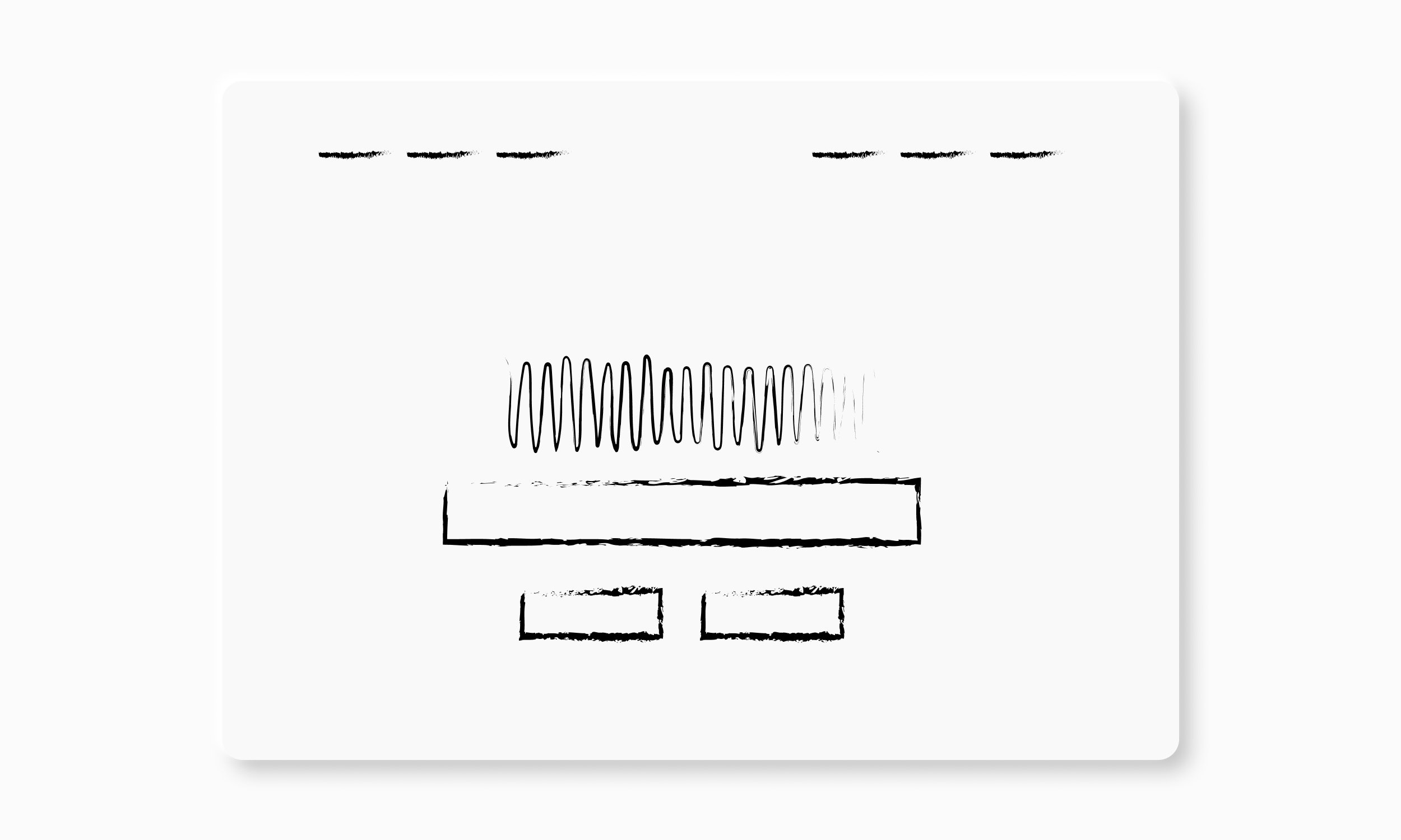
Users interact with the websites in predictable patterns. If we conform to the patterns and design in accordance with them, it can help clarify information hierarchy & communicate effectively. The eye movement typically goes in 4 quadrants as numbered.

Buttons that click
A good website interface elevates and displays the right amount of timely, relevant information from with additional contexts. And buttons are extremely important attribute of a website. A simple human interface needs to be intuitive and doesn’t require users to learn any behaviour.
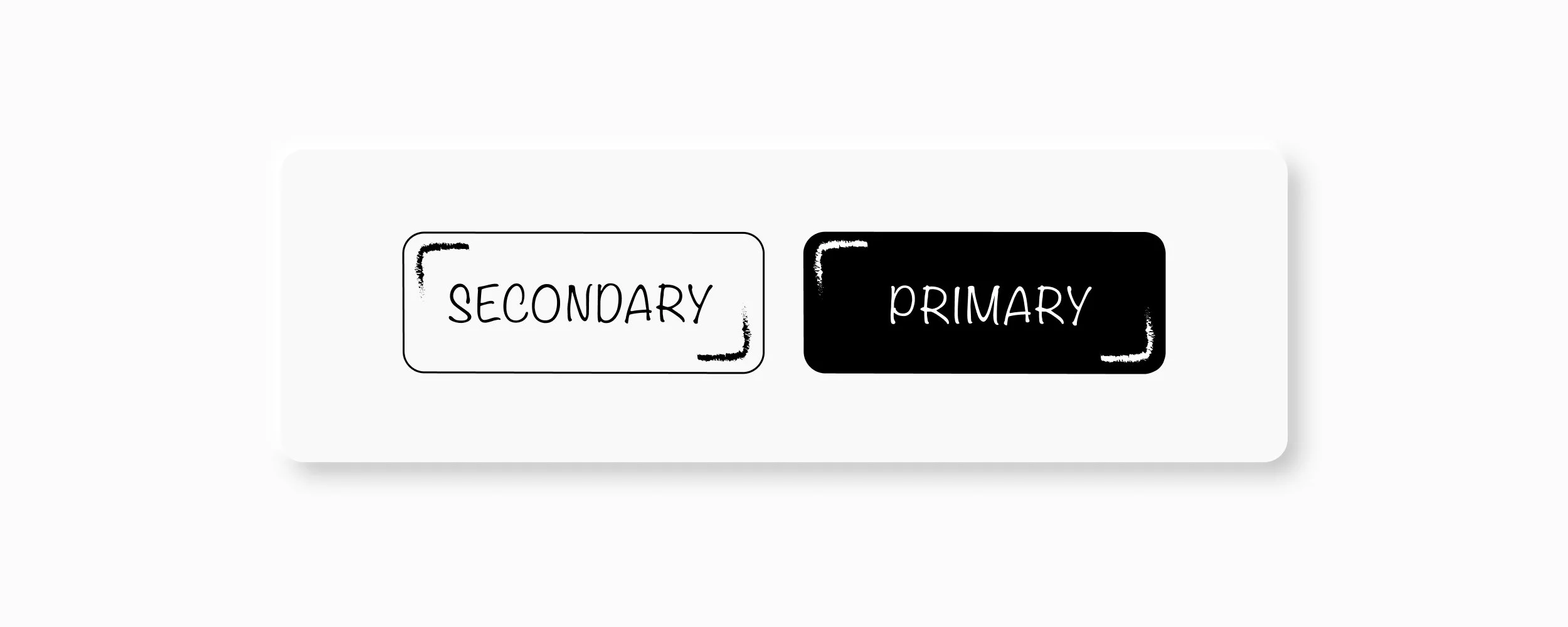
When designing buttons, we gave the primary button a fill. When a button is filled with colour, it grabs more user attention. The other button, is a secondary task that should be chosen if the user doesn’t choose primary button. For example, “Book a Test Drive” can be primary button and “Learn More” can be secondary button.
Large & Complex Data
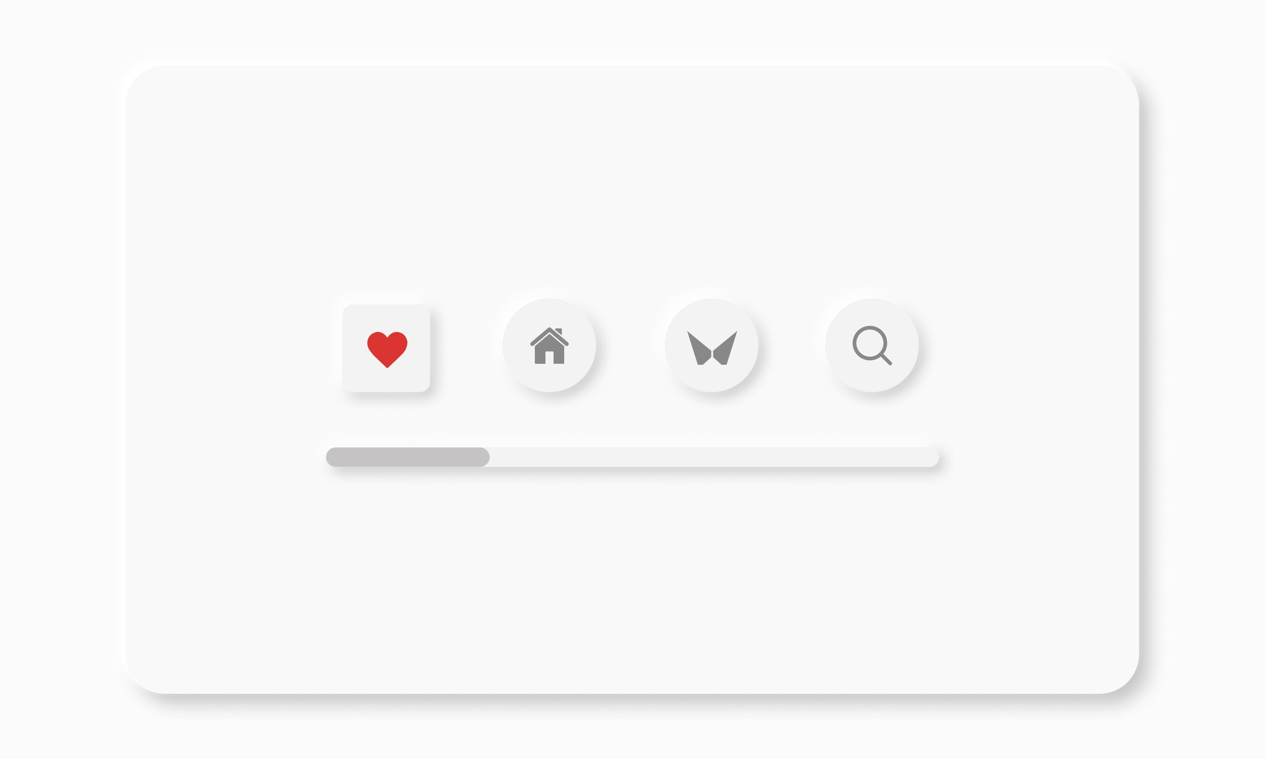
When there are many elements on a page, everything tries to steal user attention. A good human interface directs and subtly guides the attention. So, in such cases, Mahindra websites should prioritise one element. Moreover, when the navigation buttons are too many, they can be divided between top and left pane.

Simplified design
When it comes to iconography, an effective icon is an asset that directly expresses the concept and is instantly understood. We proposed that Mahindra uses more authentic icons that showcase integrity of the brand. Showing exactness can engage user’s senses and bring on-screen familiarity into their physical world.

Judicious use of space, especially in navigation tab can enhance communication, provide visual balance, and help users understand information. Contrary to that, cramping in too many buttons can confuse the users. Therefore, we recommended few key navigation buttons that will help users make the decision faster.

All the principles finally come together to define human interface design principles for Mahindra that is implemented across all websites. They were also taken forward to create coherence between the websites and the apps interface. Consistency of the digital system inspires trust in the consumers.

* All logos, design trademarks of other car brands are used for representation purpose only. Copyrights held with their respective owners.
Client Testimonial:
“Our work with Yellow Fishes has been super. We asked for an exploratory exercise in building cohesiveness across our digital presence. In extremely short timelines! Ashish and his team came up with a compelling delivery, following a convincing design process, with suitable benchmarking, insightful references and creative recommendations. Their interactions were timely and dedicated. All in all, they are a great team to work with.”

Aseef Kadir // Principal Designer, Mahindra & Mahindra (Mumbai)
Love our craft?
Similar Case Studies

Vserv
Global // Brand Strategy & Full Brand Rejuvenation

Furtherise
India // Logo, Identity Design, Menu & Communication Design